Cart & Checkout
After successfully launching a redesigned homepage for Ulta Beauty’s mobile apps, the team re-centered and focused on the purchase funnel — more specifically cart and checkout. We chose cart and checkout as they were some of the leading contributors to guest frustration.
Details
Platform
iOS
Android
Impacts
Account
Order Confirmation
Rewards
Role
UX Design
Visual Design
Interaction Design
Core Team
Shaun Toomey
Nicholas Eby
Stephanie Chen
Opportunity
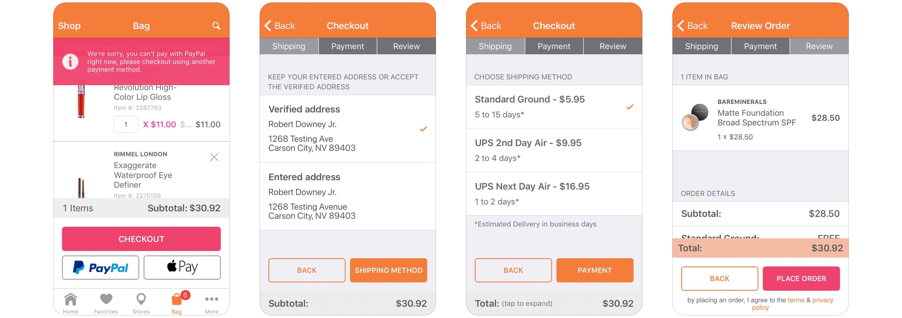
Ulta Beauty's cart and checkout flows were never built with any sort of design thinking and there had been no update to these features in years. Many usability and accessibility issues existed within the experience and this created confusion throughout the process, low conversion rates, and high cart abandonment.
From a visual perspective, primary button colors changed from screen to screen and no interface elements aligned with the WCAG guidelines.
Cart (Bag)
Cart had a bad case of friction points. An always present bottom bar filled the viewport taking up valuable interaction space. Required inputs were buried down the page, while the primary call-to-action blocked half the screen which allowed guests to proceed into checkout without ever knowing mandatory items existed. Feedback and messaging within the experience were ambiguous and largely absent, adding to guest confusion.
Checkout
Upon entering checkout guests were greeted with a multi-step checkout process. Shipping details were split into two steps - one for shipping address input and another for selecting the shipping method. This felt a bit awkward and unnecessary. The following steps were payment and billing details, order review and order confirmation. Each step needing updated information architecture, visual design consistency and error-handling.

Objectives
- Single page for cart and checkout
- Align with WCAG 2.0 guidelines for accessibility
- Remove friction points to improve guest experience
- Enable self help with clear messaging and alerts.
- Reduce customer support calls
- Reduce cart abandonment
- Increase conversion
- Improve integrations with Apple Pay and PayPal
- Improve backend reliability
- Increase trust in order placement
Solution
Outcome
A significant reduction in cart abandonment and checkout bounce rates were seen after launch. Conversion rates increased and the new backend held up nicely against the increased demand caused by Black Friday traffic. Overall this release had positive impacts on year over year revenue for the app and guests were certainly enjoying it...
So convenient!
I cannot go without my Ulta app! This app makes it so easy to keep track of and stay on top of the most recent offers, sales and perks offered, and allows me to conveniently stay connected to all things beauty. Being able to securely store credit card info makes ordering a breeze (almost TOO easy!)...