Rewards 2.0
The loyalty team at Ulta Beauty sought to increase member growth, as well as, member spend by optimizing and innovating the Ultamate Rewards program.
Details
Platform
iOS
Android
Impacts
Home
Rewards
Account
Role
UX Design
Visual Design
Interaction Design
Research
Core Team
Kory Blair
Robert Figueras
Stephanie Chen
Amy Mohr
Opportunity
Two key initiatives came from working sessions the team held to kick off the rewards program redesign project:
- Optimize by strengthening guest engagement
- Innovate by evolving the program for sustained success
These two initiatives allowed us to create a framework to validate our ideas, research and hypotheses against.
Features
Core features needed to surprise and delight, be experiential, build on the core program and bolster transactions.
Delivery
The collective set of features and their execution needed to manifest in a simple, transparent, motivating and/or celebratory manner.
Purpose
The program’s features and delivery needed to build upon the reward program's larger objectives — optimization and innovation.
Research
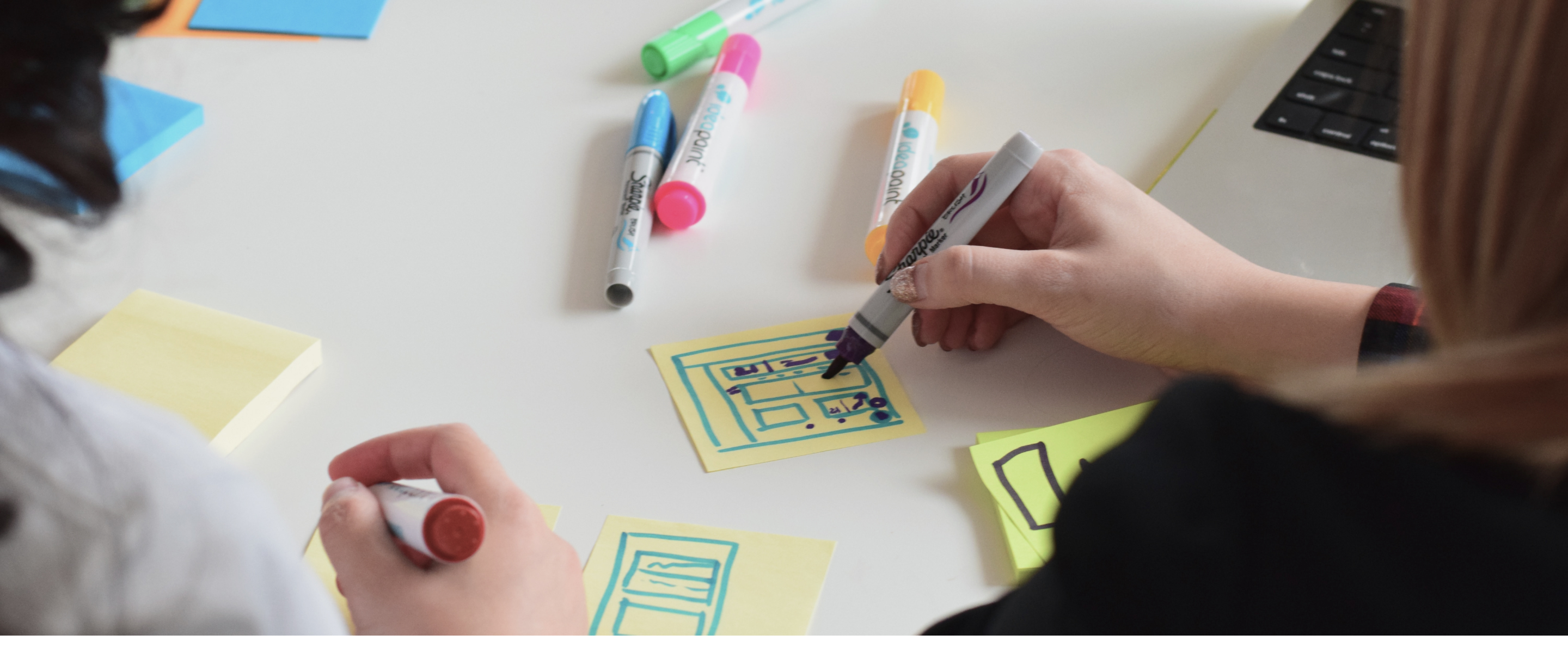
With this project, the app product team worked closely with our cross-functional business partners on the loyalty and customer insights teams. Data from the team’s separate research sessions were shared and synthesized collectively. We also dove deep into the voice of the Ulta Beauty customer and their understanding of the Ultamate Rewards program by partnering with the customer insights team to gather observational data from live feedback sessions.
From these various research methods we began to find themes and commonalities, such as: loyalty members struggled to keep track of their loyalty points and status in the program. Members also had a hard time understanding the value associated with their points and the different tiers within the program.
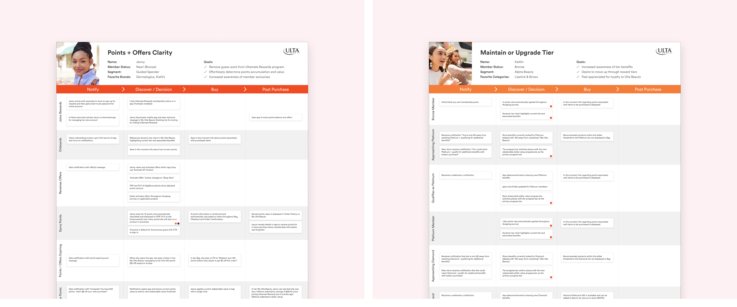
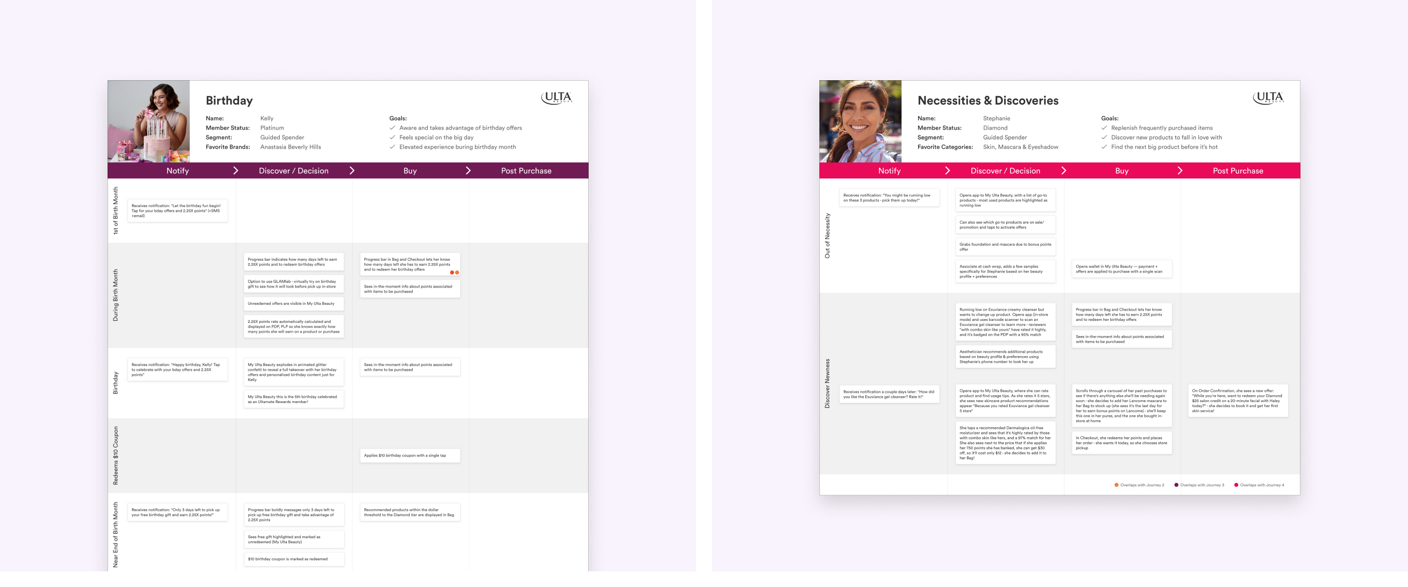
These themes gave us the information needed to create four main user journeys. From this point we selectively chose a group of key business partners from merchandising, engineering, product, marketing and loyalty and held a brainstorming session to define touch-points throughout the four user journeys previously defined. During the brainstorm we also reserved time to ideate on implementations and solutions.
Objectives
After the brainstorming session we met with the leadership and loyalty team to ensure that our proposed path forward aligned with their objectives and strategies. The following list of objectives were the outcome of that meeting:
- Bring clarity to rewards program
- Make it easier to understand progress and where you sit within it
- Add celebratory moments (birthday, level increase, etc)
- Make app rewards program tool of choice
- Unified inbox for central placement of offers and messages
- Homepage module
- Redesign rewards page and turn into dashboard with secondary tab explaining the program
- Encourage guests to stay involved and active in rewards program
- Communicate perks and strategies for most value
Validate
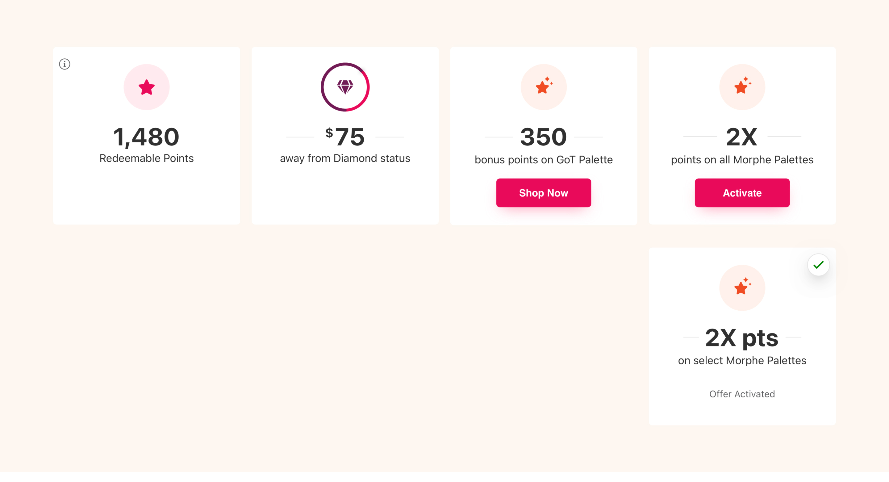
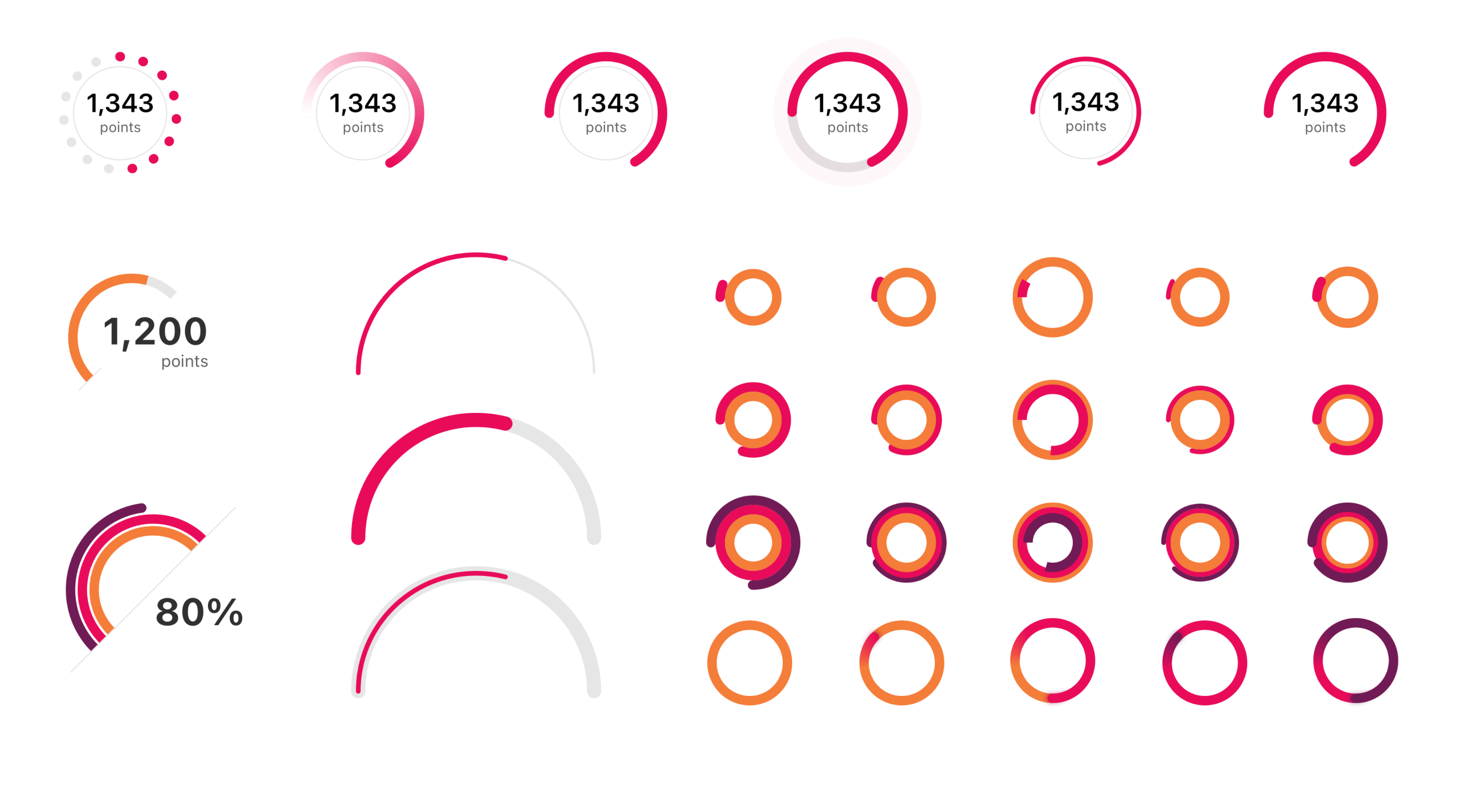
After gathering requirements, ideating and solutioning, I began to refine the ideas into testable hypotheses based off of the objectives listed above and created prototypes to validate the design decisions. A few rounds of testing and presentations to leadership resulted in numerous iterations and finally a vetted solution.
Solution
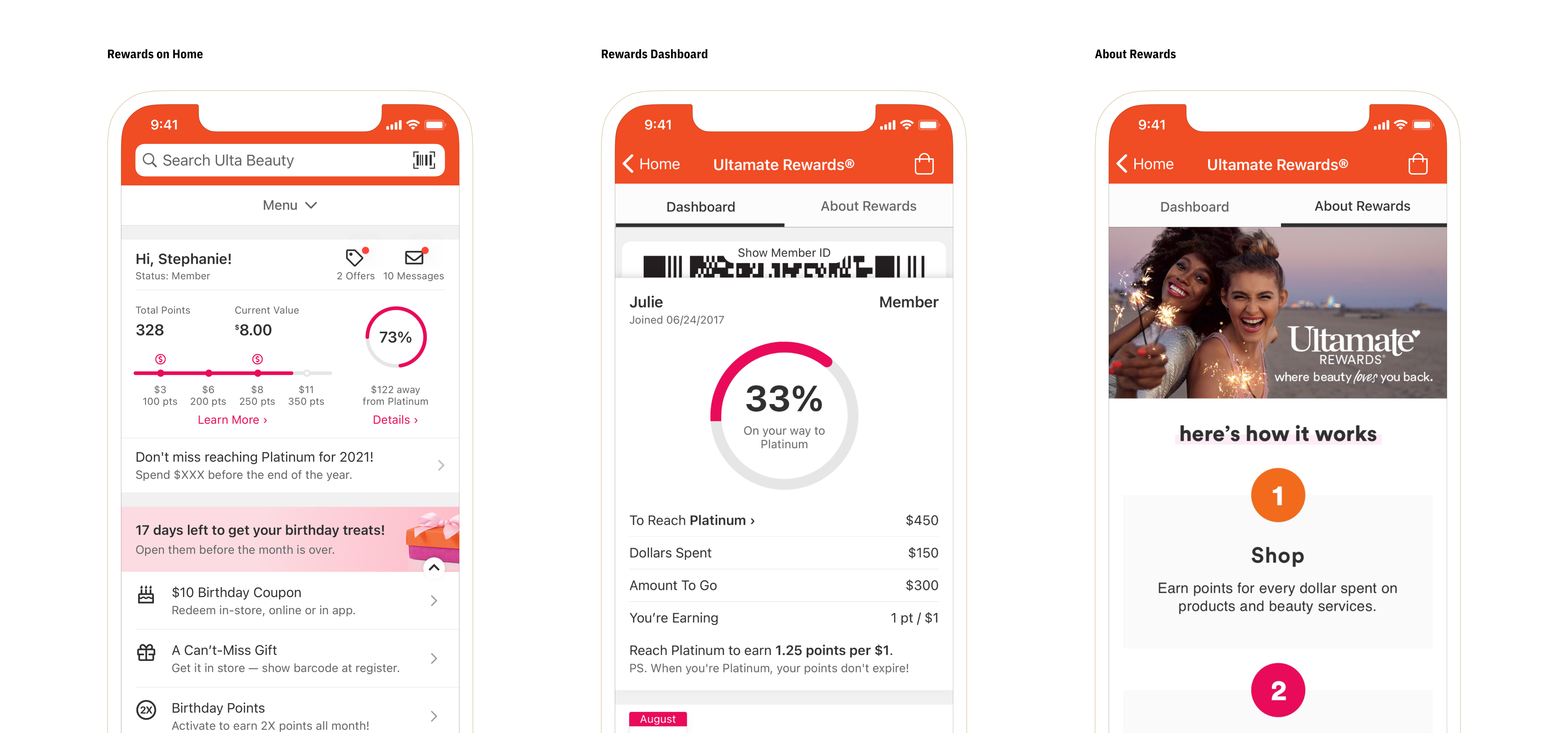
While seeking to make the Ulta Beauty app the primary tool for members of the rewards program, we designed a module to showcase high-level rewards details for quick, glanceable information about the guests status. This added personalized content on the homepage experience with celebratory birthday messaging and tier achievements at the right moments.
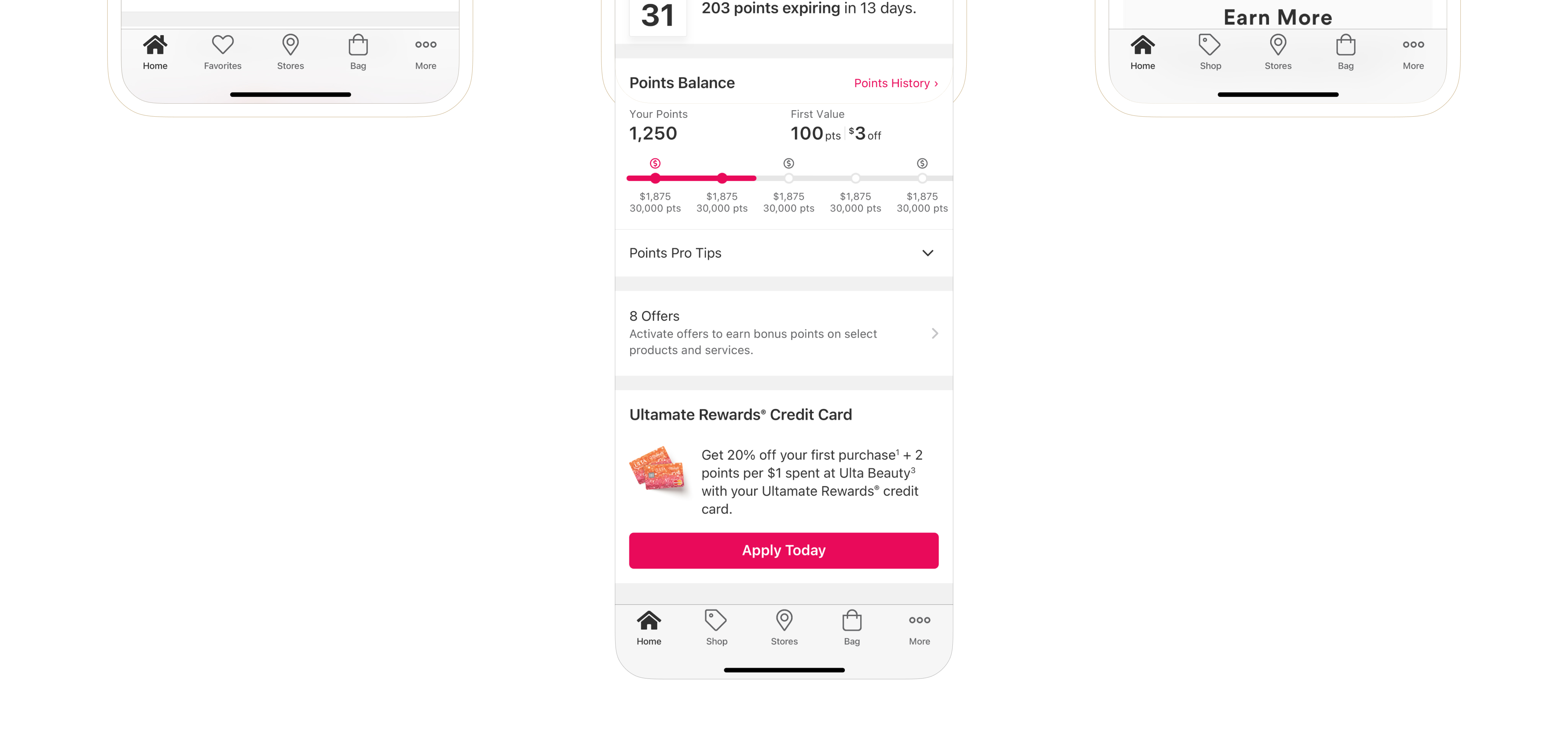
The rewards program had an entire redesign creating a dashboard for guests to see all the details that pertain to their journey through the program. Another tab was added for guests who didn’t know about the program or wanted to better understand the details of how the program works.
